Sagaponack
UX/UI Makeover
Goal
Take this decent but non-functional website to the next level & prioritize mobile functionality by designing a truly responsive site.
Solution
Taking into consideration usability tests, interviews, and heuristics, we designed a clear universal navigation system, and updated some aesthetics as well.
Company
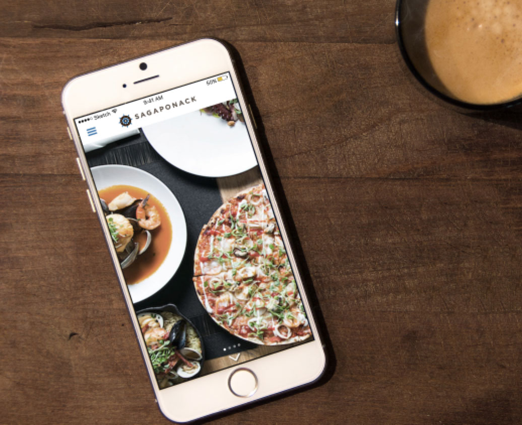
Sagaponack is a seafood, upstate NY inspired restaurant that has great reviews on yelp. We still need to knock on their door and let them know how we’ve improved their site.
1. Heuristic Analysis
We performed a quick analysis to make sure we captured all of the major issues of the site and found the attributes lacking:
- visibility of system status
- consistency & standards
- user control & freedom
- recognition over recall
2. Usability Tests
The next step was getting the site in front of its likely users. Usability tests were done with five people who lived in the area and frequented local restaurants. A quick interview was also done regarding:
- gallery of food images
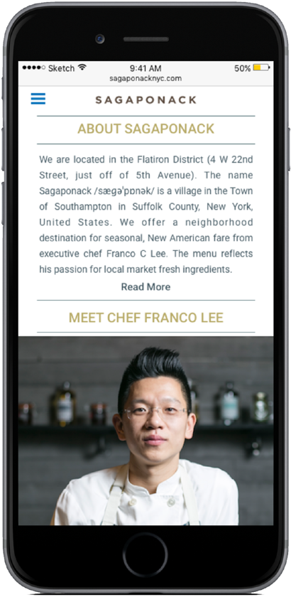
- chef's biography
- interactive map
“It looks like they might have good food, but I probably would’ve given up already”
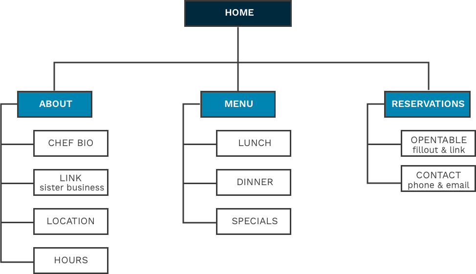
3. Site Map
To visualize a solution, we first created a current site map. Then we diverged and created three separate solutions, and merged these to create a final solution.
Original Site Map
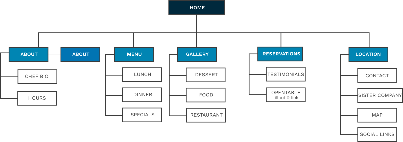
Key Changes
- condensed information into three clear categories
- removed image gallery
- highlighted sister catering company
- added location, contact, and social links at the footer of every page
Revised Site Map
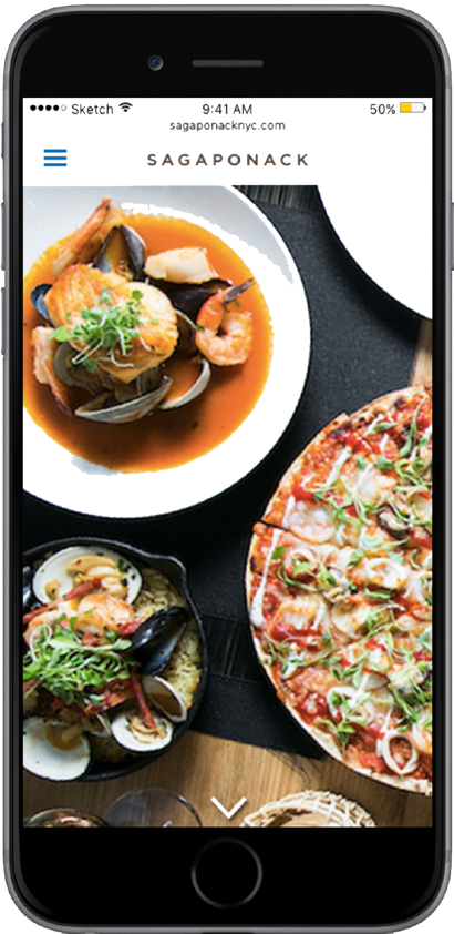
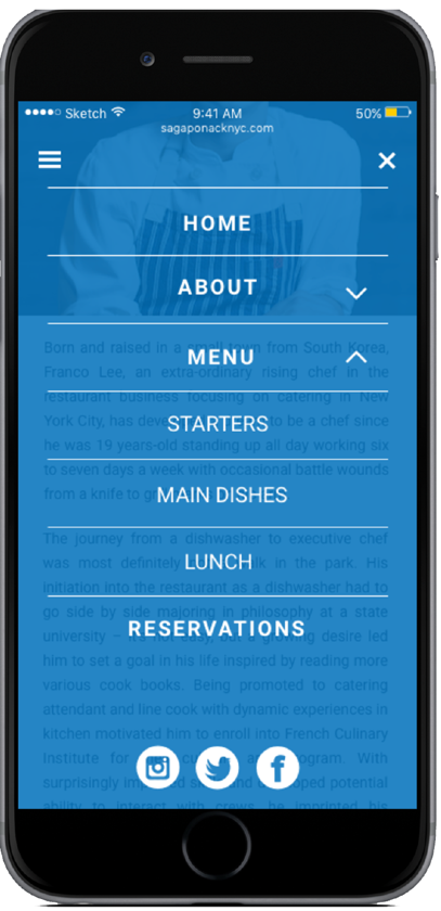
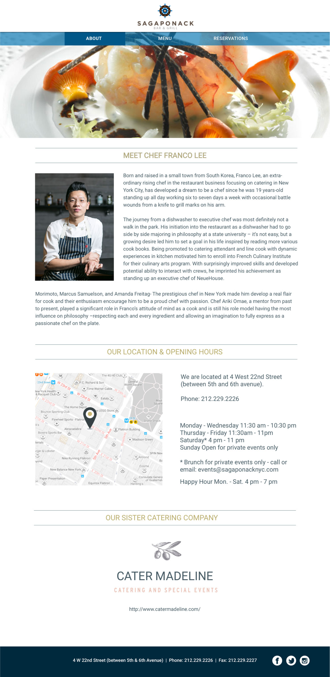
4. Responsive Redesign
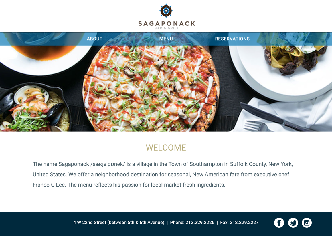
In addition to creating a more organized, user friendly, responsive site, we also wanted to design something true to the current brand. We also wanted to utilize the beautiful photography that was currently hidden on the site, and give more prominence to their sister catering company. The address, phone number, and social media links are accessible at the bottom of every page.
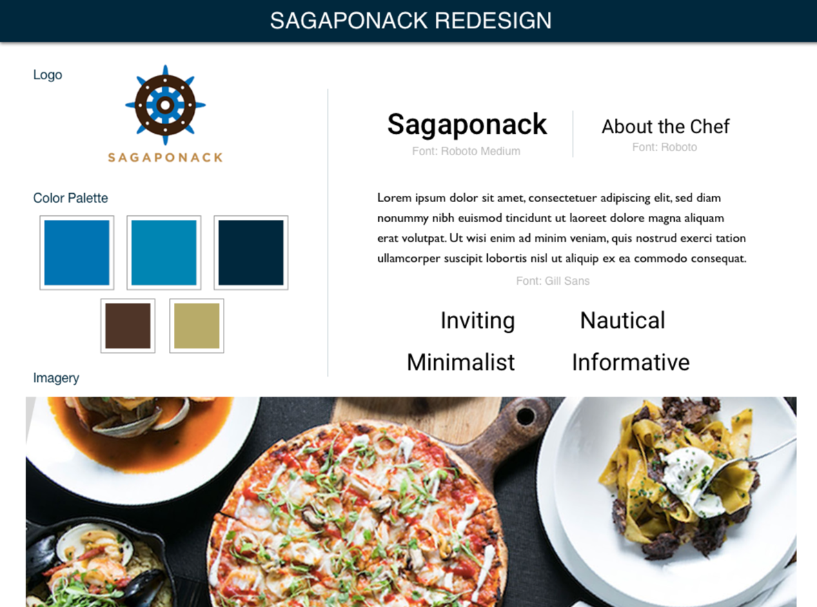
Style Guide
Final Designs
4. Next Steps
Redesign logo, or at least narrow it down to one! All of the images below were found on their site. Let’s hear it for brand consistency!